
By the time we graduate high school, we learn that they never taught us the most exciting things there. Sure, you might be able to name the European countries or point New York on the map, but does that give you a real understanding of how the world functions? We have gathered a tremendous and informative selection of infographic maps that they should’ve shown us at school to fill this gap. Every single one of these cool maps reveals different fun and interesting facts, which can actually help you draw some pretty interesting conclusions.
1. Happiness Across the World
Many people say that the key to living and having a successful life is happiness. But feeling happy isn’t as simple as it sounds, there are in fact many things that influence one’s ability to truly feel happy. Such as lifestyle, income, political situation, living conditions, clean water, clean air, and levels of freedom that they feel.
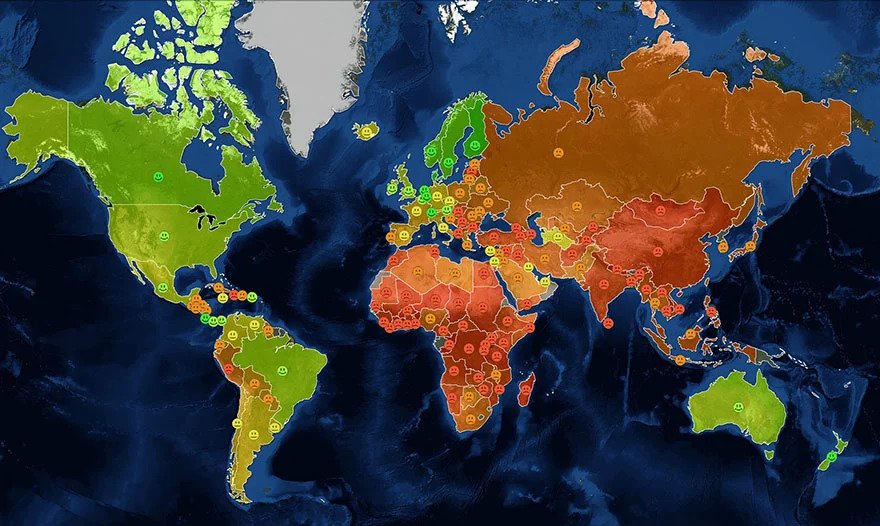
This map shows us the different levels of happiness felt throughout the world, with green being the highest and red being the lowest. It may not come as a shock to see that many of the westernized countries are generally much “happier” than other countries.
2. Hottest and Sexiest Women Across the Globe
When it comes to who we find attractive, it is completely left to societal and cultural influences as well as personal preferences. And whilst it might seem crude to talk strictly based on people’s appearance, it almost feels like lying if we weren’t to be honest about how people actually view one another.
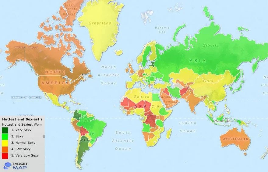
According to this map, the countries outlined in the darkest shade of green are “very sexy”, whilst the countries in red are “very low sexy”. We aren’t the biggest fans of judging women in such a harsh way, especially when we don’t know the criteria in which this study took place.
3. Rates of Tolerance Towards Different Races
It is extremely unfortunate that we live in a world where there is so much intolerance towards people that are different from what you know. If we were all just a little bit more tolerant of ‘the other’, the things that we don’t immediately recognize, then perhaps we would live in a more tolerant world.
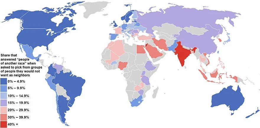
According to this map, there are plenty of countries that would consider themselves tolerant, and perhaps that is true. But from what we see around the world, this doesn’t always ring true. Sure, everything is a process. But let’s be more tolerant of one another and share the love.
4. Countries That Are More Welcoming and Less Welcoming to Foreigners
It might never have crossed your mind, but there are many countries that rely heavily on the tourism industry. There are so many exotic, romantic, and just plain beautiful places to visit in the world, the list is never-ending.
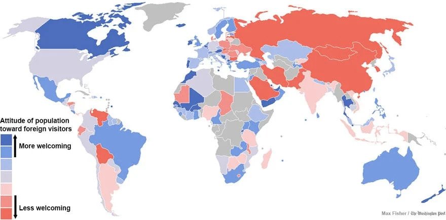
And even though having foreigners come to visit your country can be exciting, there are plenty of countries that are not so excited by the prospect. We can understand that sometimes it can be annoying to see tourists everywhere, but it should be nice knowing that people take an interest in visiting your country.
5. More People Live Within this Circle Than Outside Of it
We know that there are many different countries on this planet, but not all of them are completely inhabitable. This leaves many countries with vast unused space, that is often neglected and not given another use. And there are some countries that are overpopulated due to how much liveable land they have.
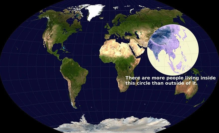
Did you know that there are more people living within the confines of Asia than there are living outside of the continent? When you stop and think about it, that is a crazy statistic considering how many people there are that live on this planet together.
6. What Each Country Leads the World In
Each country in the world has something it’s most known for, one thing that it leads in. If we held a competition, that would be the country’s expertise. This map tells us what each country in the world leads in, and we’re pretty sure some of you could’ve guessed most of these things.
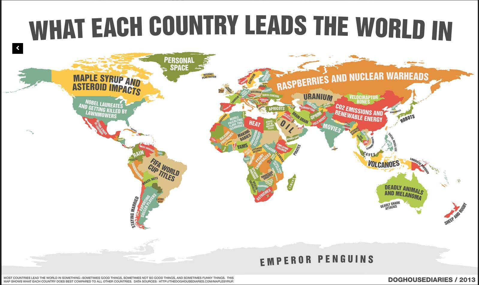
According to the map, Brazil leads in FIFA World Cup titles- a lot of great soccer players hail from Brazil, so we can’t say we’re surprised. Canada, according to this map, leads in Maple Syrup and asteroid impacts. We’re not sure about that second title, but Canada is definitely known worldwide for its tasty, authentic maple syrup. In what field does your country lead?
7. Popular Sports According to Different Countries
When it comes to sports, there is no doubt that certain countries are going to favor some sports over others. After all, we can’t ignore the fact that certain sports were literally created in specific countries and therefore have a very natural attachment to one another.
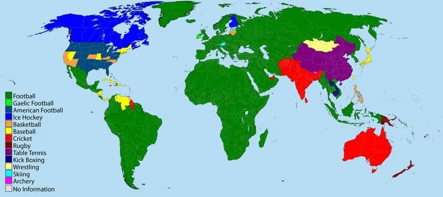
Let’s be honest, is it surprising that Football happens to be the most popular sport according to this map? England did manage to conquer many countries during its time as the New Empire. It appears that Cricket, also another English sport is popular in other colonized countries such as Australia and India.
8. Fertility Rates Across the World
When it comes to children and having babies, it is no secret that certain countries have had issues or certain rules in the past. These days things are a little different and the focus has turned more to fertility rates and the number of children people are having.
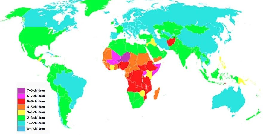
According to this world map, there are many parts of Africa that seem to be among the most fertile places on the planet. With many other western countries between the 1-2 children mark and the 2-3 children mark.
9. Most Consumed Alcohol According to Each Country
Is there anything more wonderful than sitting back, relaxing, and drinking your preferred alcoholic beverage? There is just something about that type of situation that, at a certain age is more exciting than any other type of activity.
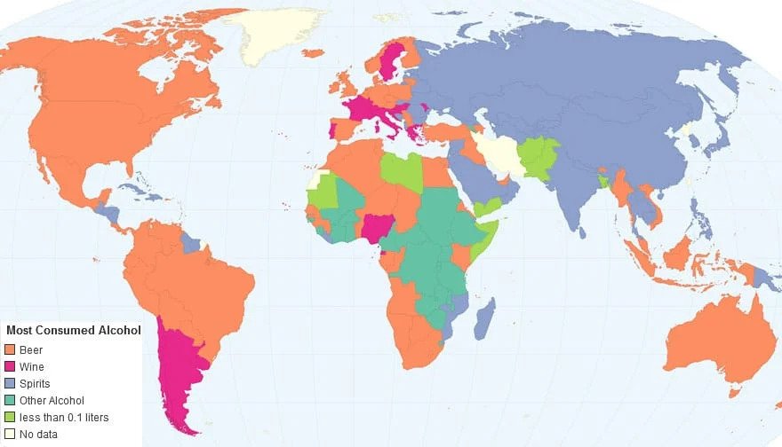
Probably as unsurprising as the above statistic, but apparently a large portion of the world loves beer. And whilst it might be surprising that this is the answer for some countries, it isn’t unsurprising that Russia’s choice in most consumed beverage would fall in the spirits section.
As more time passes, it is becoming more and more clear just how badly different countries are affected by obesity. With fresh produce and certain foods becoming more and more expensive, the average person isn’t able to financially keep up with the growing prices.
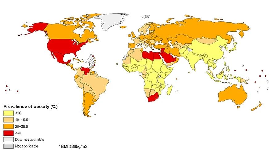
This particular map outlines the rates of obesity in different countries, and some of the results might shock you. With massive fast-food chains like McDonald’s all around the world, these shocking statistics are possible. How is it that some places can be in need of food whilst others are just exploding with it?
11. The ‘Best’ and ‘Worse’ Places to Be Born
It is no secret that there are better and worse places to live in this world. But this can be measured by so many different factors and sometimes different factors for different people. What someone looks for in a country might not be what someone else is looking for.
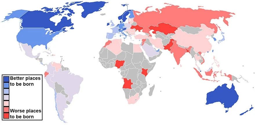
According to this index, specific places are better to be born in than other places in the world. Generally speaking, these places would be classified as more westernized. Again, there is no objective measure that can be used for everyone in this situation.
12. The Number Of Cigarettes Smoked Per Person
There are many different things in this world that can be classified as vices, but smoking cigarettes is notably one of the most commonly described ones. And even though the effects are painfully obvious, people just can’t seem to get enough of them.

This map outlines the number of cigarettes smoked per person throughout the world. The red color is the highest number of cigarettes smoked, whilst the purple tones are the least amount of cigarettes smoked per person. And once again, it looks like Russia is the top contender in this race.
13. Countries That Feel the Most and Least Loved
When it comes to feeling loved, I think most people would agree that it is a pretty big component in feeling happiness. When you feel as though you are cared for and loved for, you are often able to build up certain confidence within yourself that can not be paralleled by any other feeling.
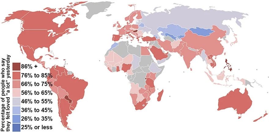
This map outlines the “percentage of people who say they felt loved ‘a lot’ yesterday”. With burgundy being the highest percentage and blue being the lowest, it is clear to see which countries seem to have the most amount of people that feel loved.
14. People Aged 25-34 in Europe Who Live With Their Parents
At one stage or another, we all have to face the music and move on from our family home. For some of us, that period is earlier in life, and for others, it happens later. But either way, it is something that we all have to do, at a certain stage in life.
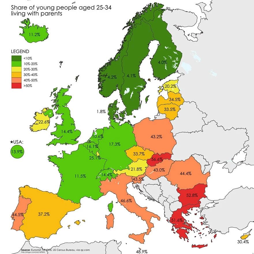
As much as Europeans seem to give off the “I am so mature and unique” vibe, they are all momma’s boys like the rest of us. Leaving home can be hard, and apparently, there are a lot of people between the 25-34 age bracket still living with their parents in different countries in Europe.
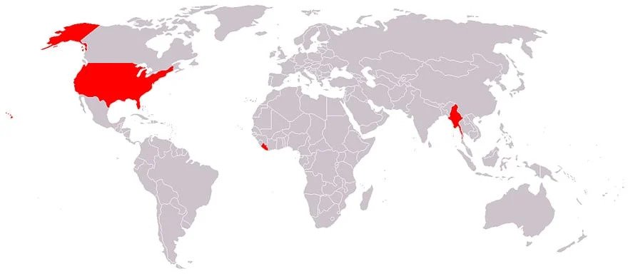
15. Countries That Don’t Use the Metric System
There are many things about the way in which we live our lives that seem extremely obvious. We human beings are creatures of habit and are used to the things that we have grown up with, no matter if there are better ways of doing things.
As much as Americans like to brag about being the best at everything, there is one thing America could do better. And that would be to switch to using the metric system. The metric system is so simple and straightforward that choosing to not use it at this point is basically just being stubborn.
16. Countries That Feel the Most and Least Loved
When it comes to feeling loved, I think most people would agree that it is a pretty big component in feeling happiness. When you feel as though you are cared for and loved for, you are often able to build up certain confidence within yourself that can not be paralleled by any other feeling.

This map outlines the “percentage of people who say they felt loved ‘a lot’ yesterday”. With burgundy being the highest percentage and blue being the lowest, it is clear to see which countries seem to have the most amount of people that feel loved.
17. The Number Of Cigarettes Smoked Per Person
There are many different things in this world that can be classified as vices, but smoking cigarettes is notably one of the most commonly described ones. And even though the effects are painfully obvious, people just can’t seem to get enough of them.
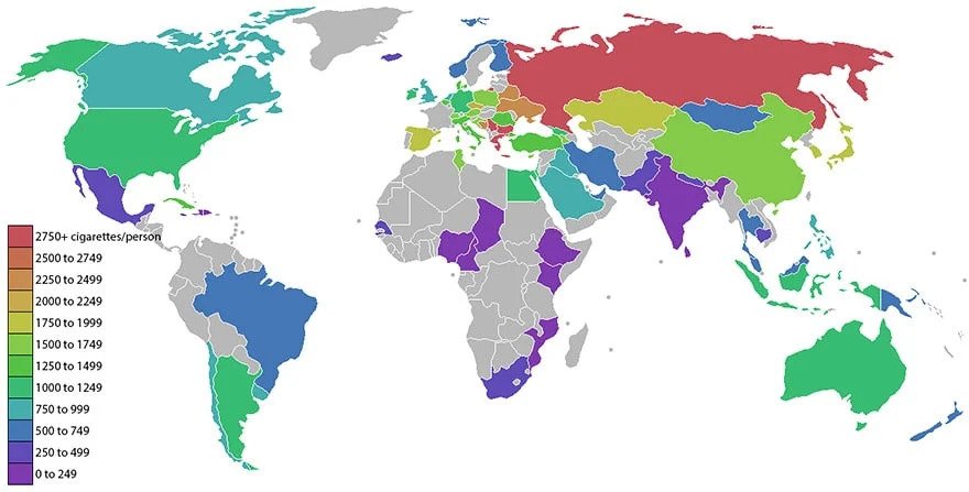
This map outlines the number of cigarettes smoked per person throughout the world. The red color is the highest number of cigarettes smoked, whilst the purple tones are the least amount of cigarettes smoked per person. And once again, it looks like Russia is the top contender in this race.
18. Countries According to Their Emotional Tendencies
Life in every country is extremely to the next. It is almost impossible to compare a country to a different country because life in each place is influenced by specific factors. And people’s emotional states are therefore impacted by many different factors.
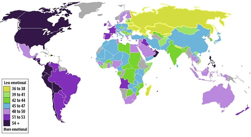
According to this map, It appears that the world is almost split equally in half between the “emotional countries” and the “less emotional countries”. Russia seems to be the biggest country with the least emotions, whilst the United States and Canada seem to be amongst the most emotional.
19. National IQ Scores
Every one of us is special in our own way, and possesses things about ourselves that no one else has. Whether that thing is someone’s ability to solve a mathematics equation, or to paint a beautiful picture, we all have things that we are good at.
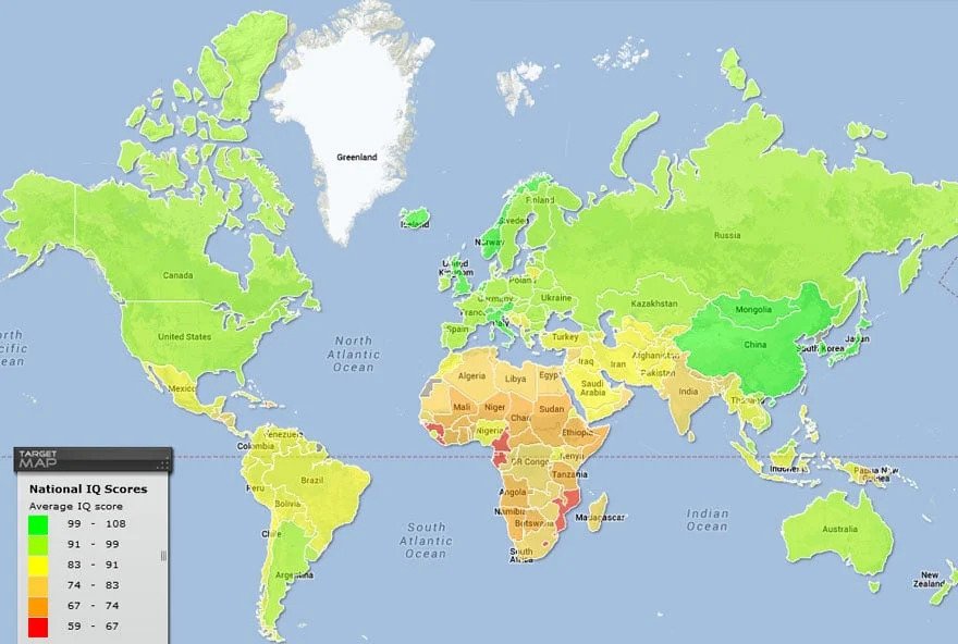
And in true sow off fashion, here are the average national IQ scores according to each country. Seeing maps like this is really great to be able to take a step back and look at the bigger picture. But it also reflects the large disparities that exist between nations and their citizens’ abilities to find education.
20. Average IQ Throughout the World
Have you ever wondered about how people from different parts of the world are better at certain things than people from other places? Generally speaking, IQ is largely connected to the culture of a place among many other things. So let’s take a look at the average IQs throughout the world!
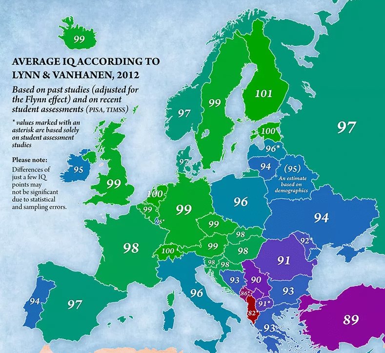
From this map, it would appear that many places in Europe have rather high IQs. Apparently, Switzerland, Estonia, and Finland are filled with incredibly intelligent people considering they all got a score of 100 or 101. However, there are many impressive scores on this map.


